Step Indicator Component
Role
Lead Designer
Timeline
8 weeks
Team
Visual Design team (4)
Skills
Visual Design, Interaction Design, Design Systems, User Research
Tools
Figma
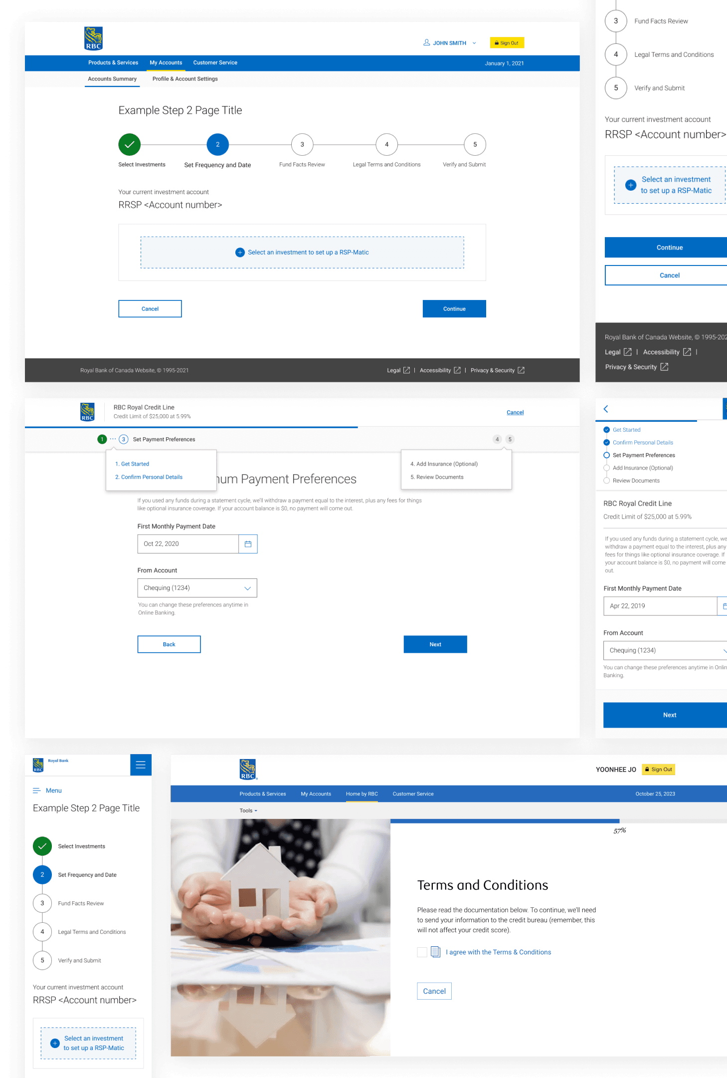
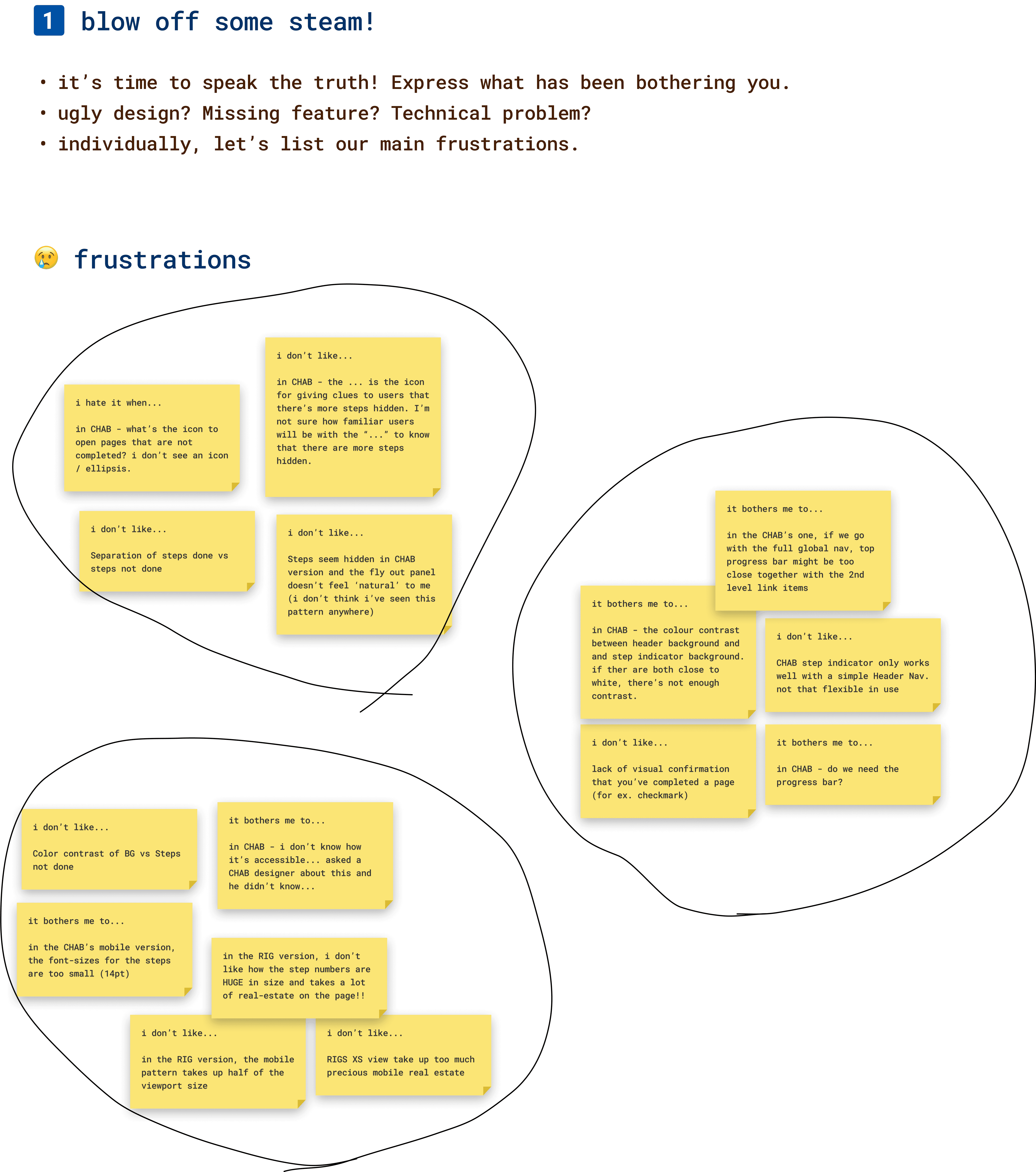
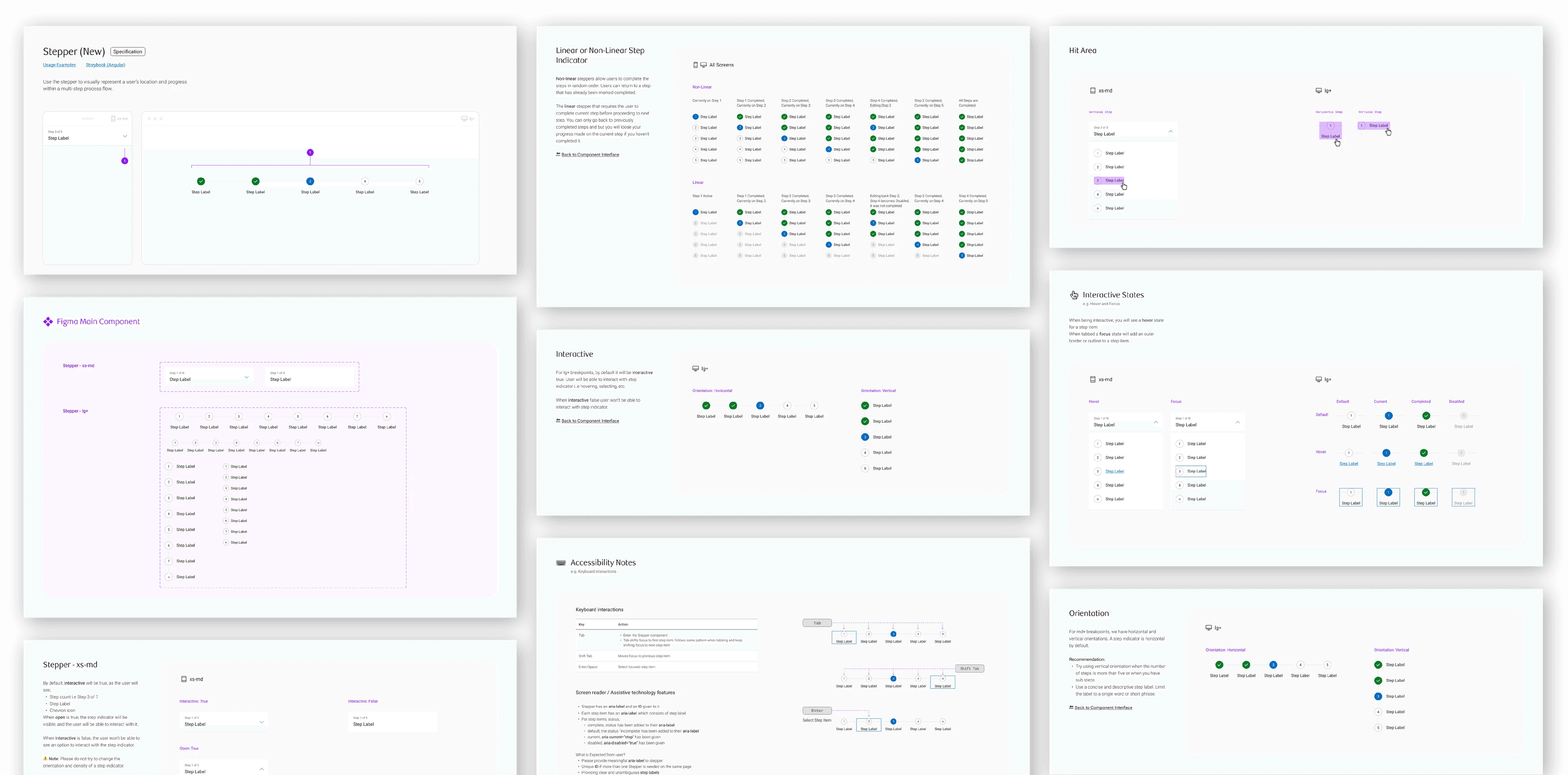
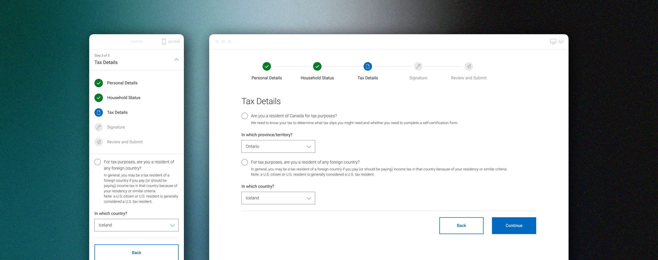
Problem Exploration
We got together as a group of 4 visual designers to brainstorm frustrations with the current step indicator component(s).
The main themes we discovered were:
01
User is not clear on what step they are on
02
Takes up too much screen real estate
03
Not flexible to use in various responsive states
04
Accessibility concerns with colour contrast and navigation