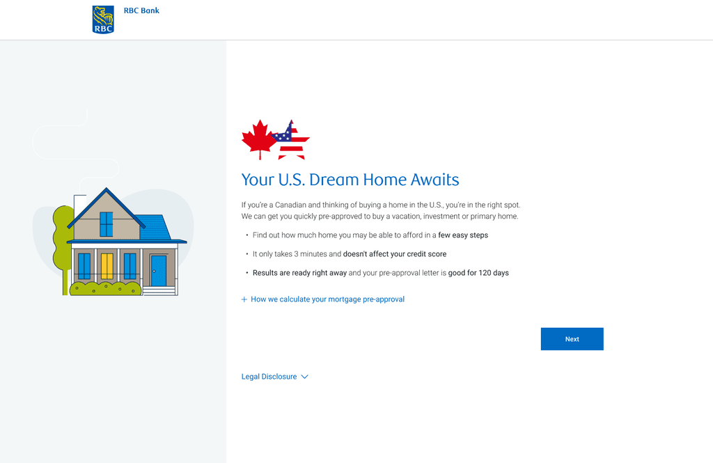
RBC Bank U.S. Pre-Approval Tool
Role
Lead Designer
Timeline
3 months
Team
Product Owner, Business Analyst, 4 Engineers, 2 User Researchers, 1 UI/UX Designer
Skills
Interaction Design, Visual Design, User Research
Tools
Figma, Mural
Problem Statement
RBC clients who wish to get pre-approved to purchase a home in the U.S. must go through a multi-channel, lengthy process.
~45 minutes
spent manually processing pre-approval per client
No dedicated tool
for pre-approvals - client has to go through 4 channels (online form, internal RBC referrals, email, and phone call)
~910 calls
per quarter to advice centre relating to pre-approvals
So we asked…
HMW simplify and shorten the time spent for clients to get pre-approved, so they can start house-shopping in the U.S. as easy as possible?
🏠
🏠
Discovery & Research
This research was conducted with cross-border mortgage holders in Canada and the U.S. and included a mix of age, gender, and region.
A total of 21 individuals participated in a 45 minute online discussion among RBC and competitive cross-border clients who considered RBC for their U.S. mortgage.


Discovery & Research
User Journey
We mapped out the user findings into a cross-border mortgage journey (specifically the pre-purchase experience), marking key pain point areas.
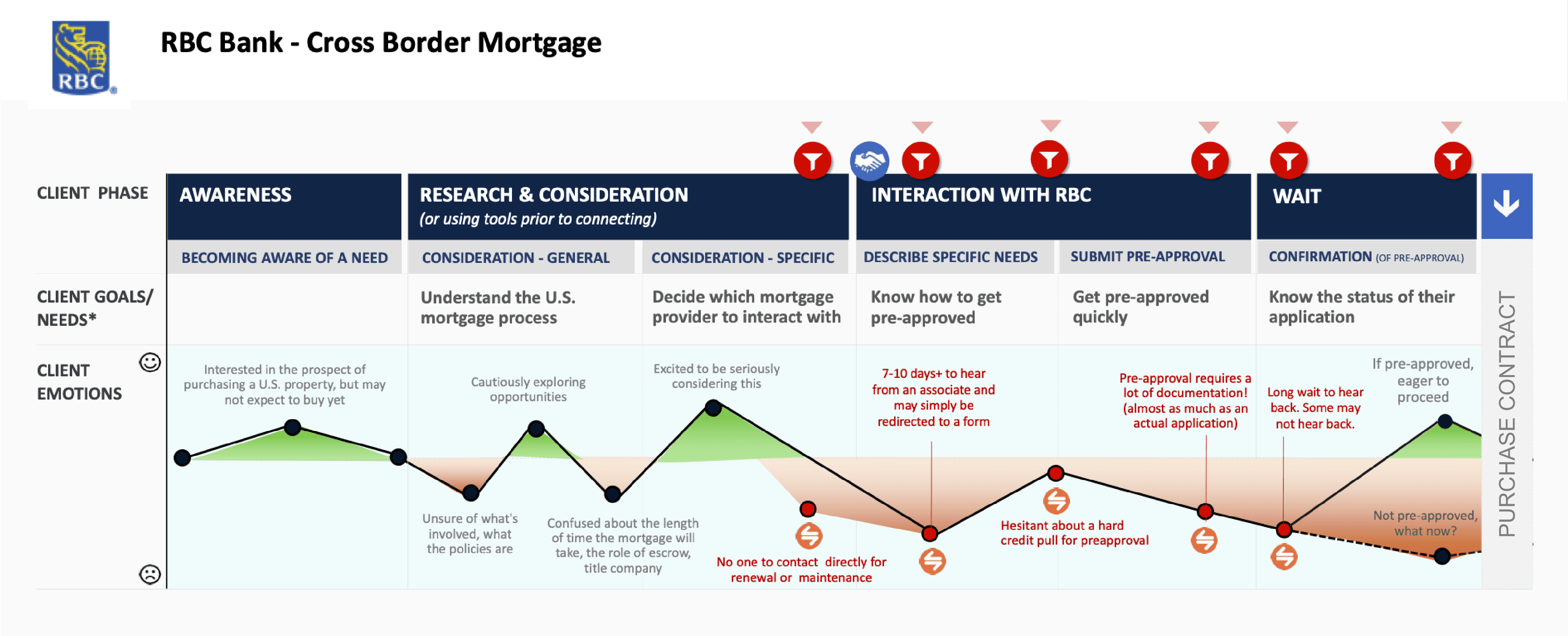
Through the research, we identified 3 main themes:
01
Need clarity in the U.S. mortgage process
Clients want to know if they can use their Canadian credit history to purchase a home in the U.S. and what to expect in the cross-border homebuying process
02
Pain in going through the manual, multi-channel process
There is an increase in drop-offs and frustration due to no designated pre-approval tool and amount of time to complete the application
03
Prefer similar pre-qualification tool used for Canadian mortgages
Clients prefer the easy, fast, and personalized aspects of the RBC pre-qualification tool for Canadian mortgages
Goal
A streamlined digital platform that simplifies and automates the mortgage pre-approval process, providing users with a fast, intuitive, and transparent experience from start to finish.
Key Features
Educate from the beginning
We need to ensure to educate our clients on the U.S. mortgage process to increase transparency and understanding.
Clients should have a very clear expectation around what to expect when applying for a pre-approval and after.
Automate where possible
One of the key factors in drop-offs in the pre-approval journey was going through multiple channels and the slow, manual process.
We should consolidate the different channels into one and reduce manual processes as much as possible.
Easy, fast, and personalized
Clients appreciated being able to get pre-qualified online anytime, anywhere and enter just a few pieces of information to receive their mortgage amount instantly in the RBC pre-qualification tool for Canadian mortgages.
We should align to the established pattern from the Canadian version, and ensure it is simple and easy to use so they are able to go house-shopping in their own timeline.
Competitive Analysis
Looking at Existing Tools
We analyzed existing pre-qualification tools that are used for Canadian mortgages (both from RBC and competitors).
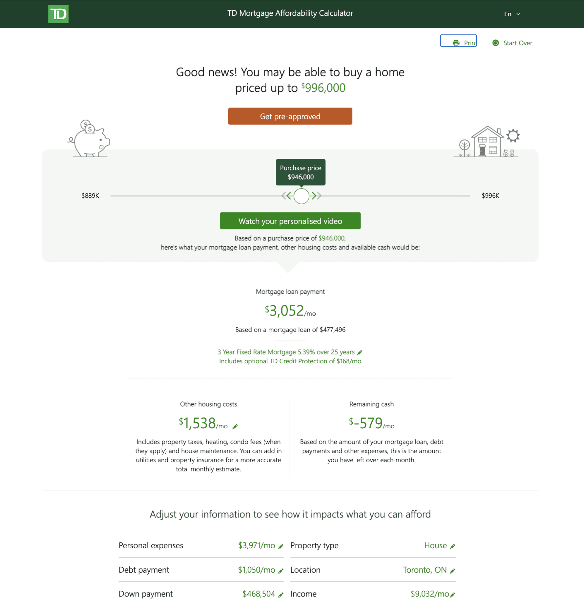
We identified similarities and found the following steps in each tool we analyzed:
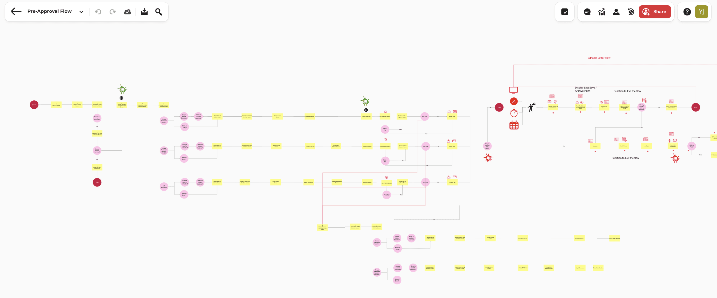
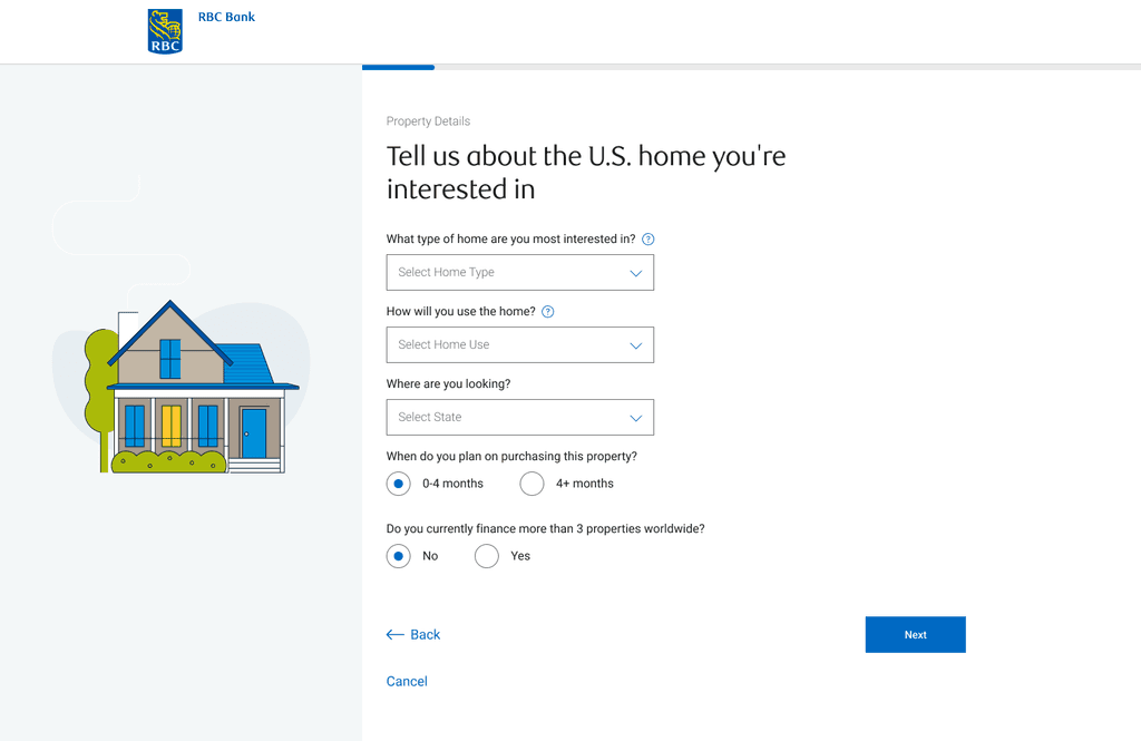
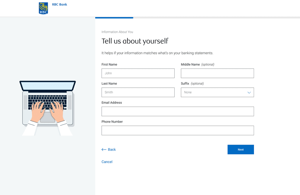
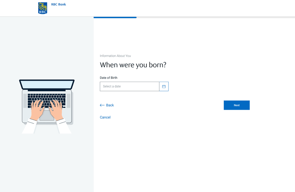
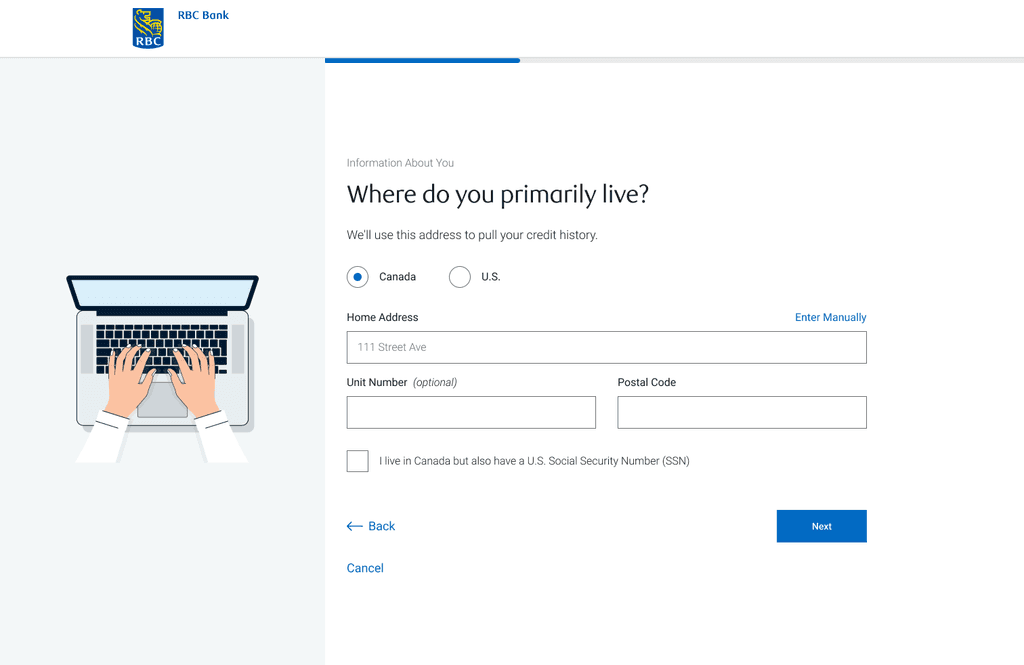
User Flow
Pre-Approval Flow
From evaluating the current U.S. pre-approval procedure and using the Canadian pre-qualification user flow, we mapped out the complete pre-approval user flow. This helped us getting a full picture of the application.
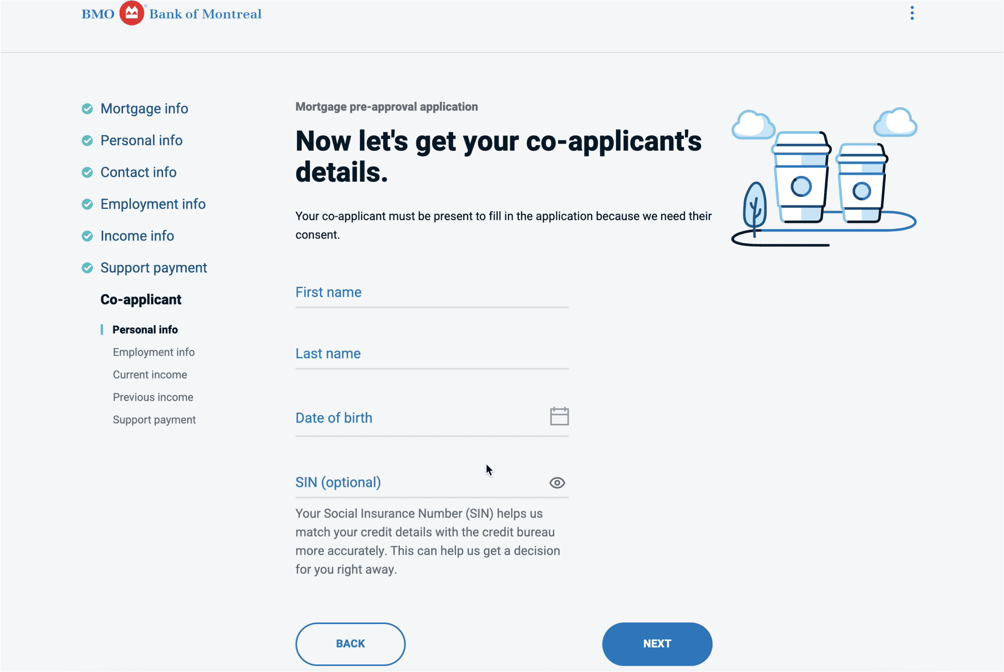
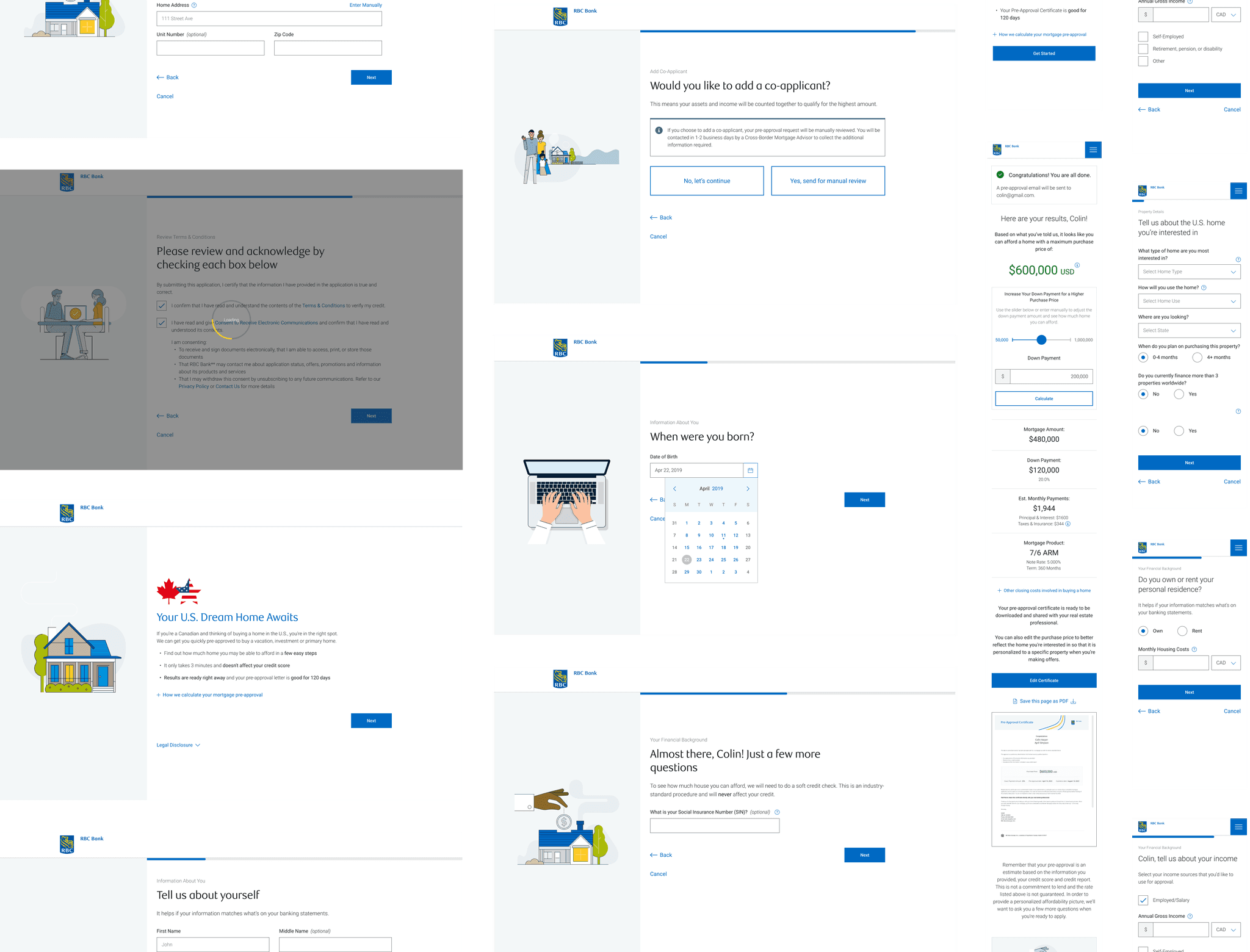
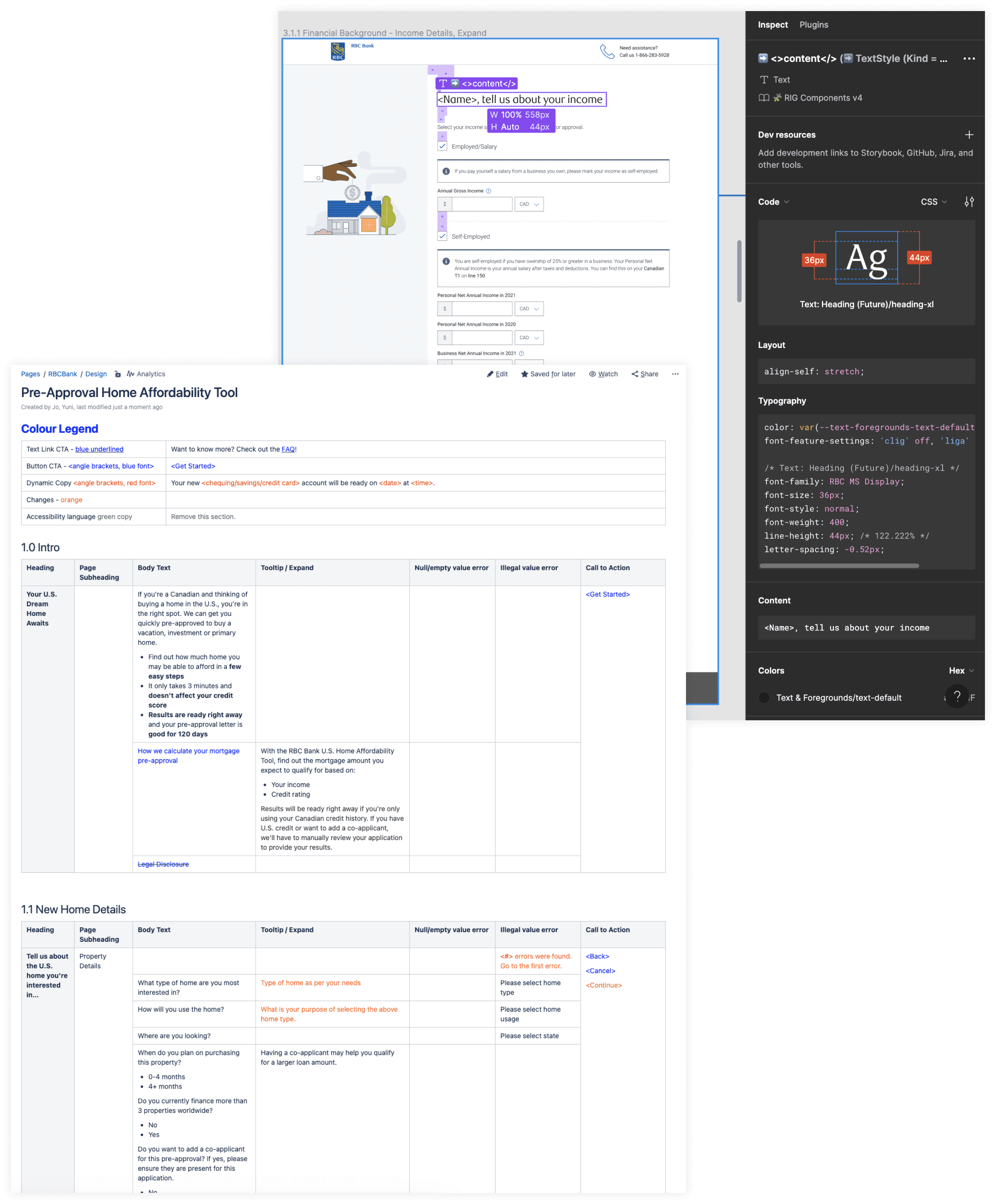
Design Exploration
Using the RBC design system library, I created various iterations using the components to create wireframes. Using Figma, I created a prototype where we tested with RBC client volunteers to evaluate the design and user flow.
Testing & Refinement
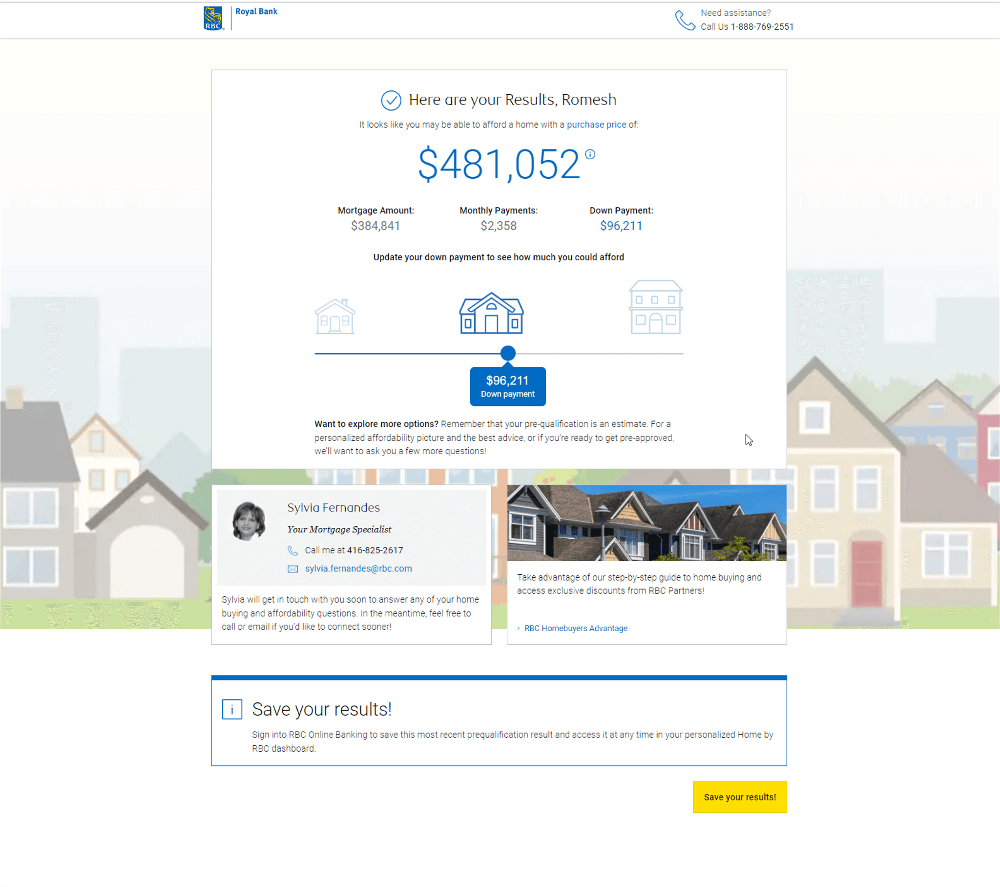
Improvement #1
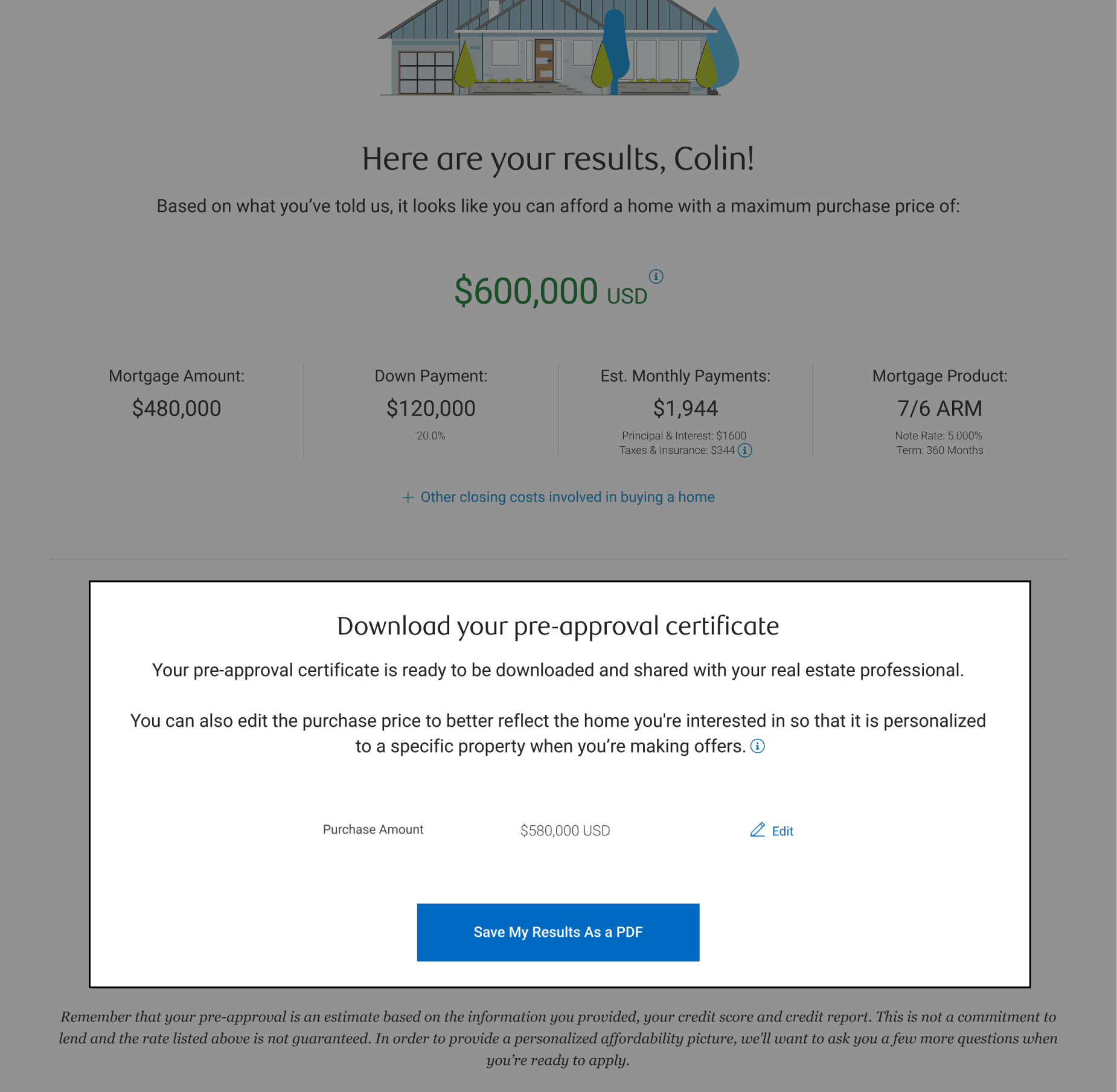
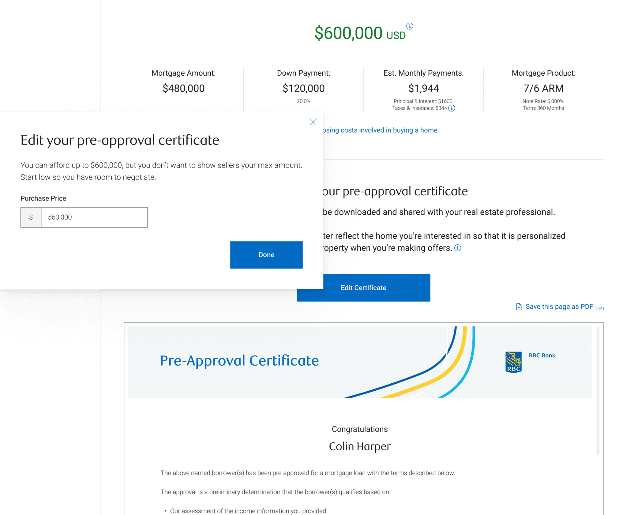
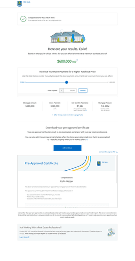
During our testing, we noticed many users missed the feature where they can download a pre-approval certificate and thought they would need to manually save their results.
We needed to make the certificate with their approved purchase amount and results more noticeable so they can take advantage of the feature.
To help spotlight the feature, we implemented a document previewer so they can immediately see the certificate with a CTA to download it as a PDF.
We also added an “Edit Certificate” button instead of an icon and text, so it’s clear they can edit the purchase amount to make it more advantageous when negotiating with the seller.
Testing & Refinement
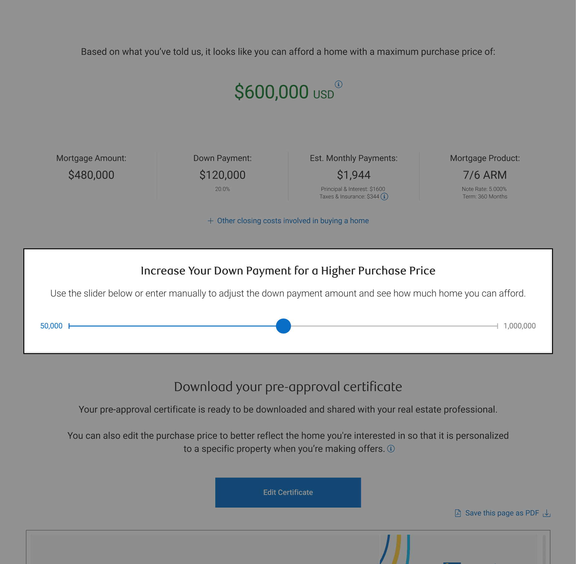
Improvement #2
When users completed the pre-approval, many asked if they were able to change the downpayment so they can be approved for a larger amount.
Instead of having the user start the application all over again, we included a slider bar on the results page where they can adjust the downpayment, and the changes would reflect the purchase price amount and other figures accordingly.
Iterated Designs
Design Handoff
I worked closely with engineers to validate the design and copy implementation. Along with daily stand ups, we scheduled weekly “Design + Tech” meetings to remove any blockers, and also held weekly demos to ensure final designs were implemented correctly.
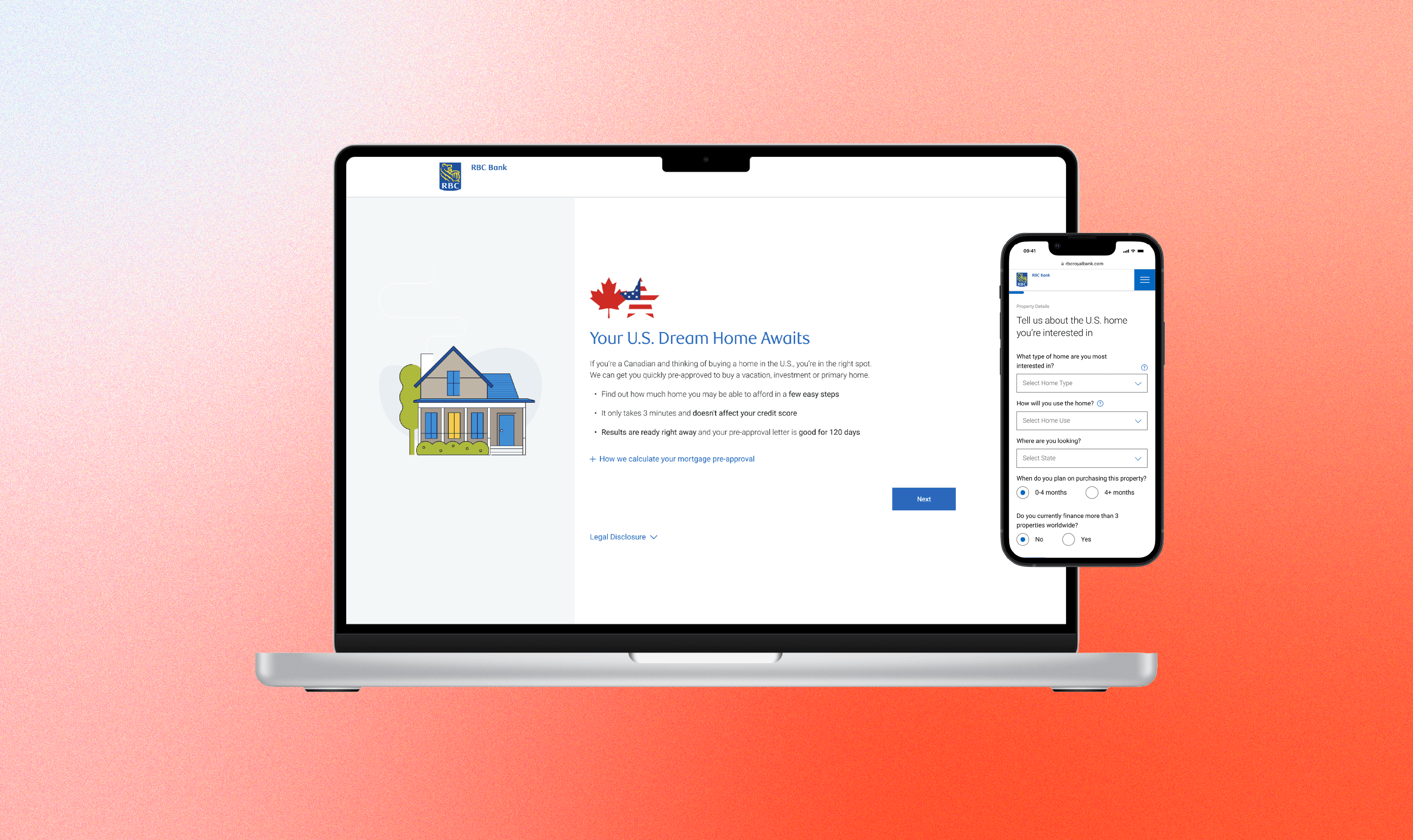
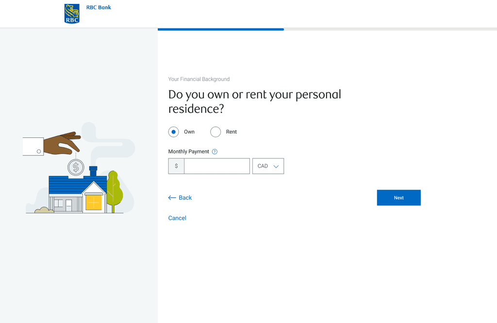
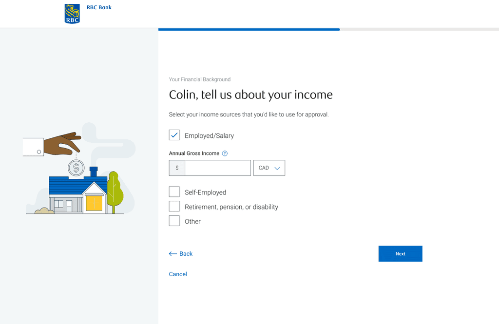
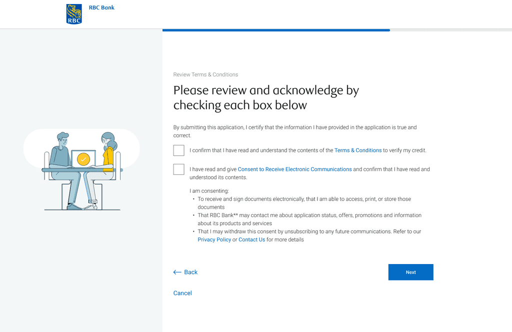
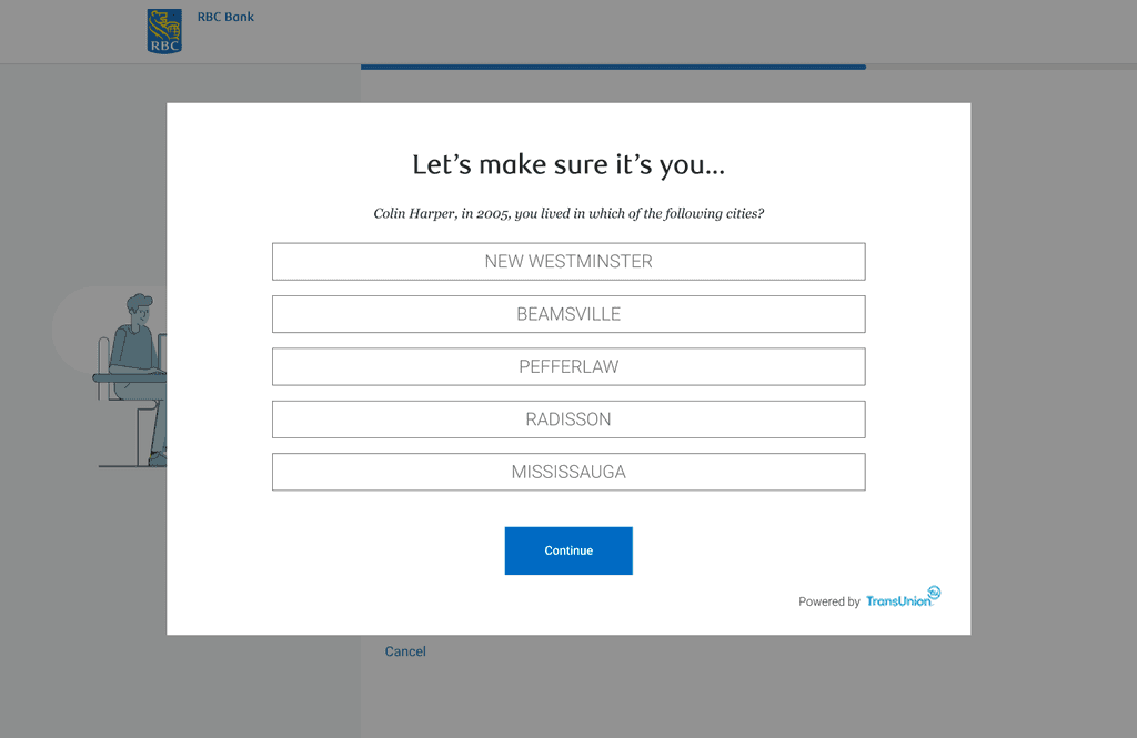
The Final Product
⏳️
Instant results
Once the application is completed, results are available right away
✏️
Fast and simple form
Only a few pieces of information are required to perform a soft credit pull to determine their mortgage amount
🪄
Personalized
Users can adjust their downpayment and purchase price to download a personalized pre-approval certificate
📱
Responsive
Users can access the tool anytime, anywhere on any device - both desktop and mobile
Impact & Results
-95%
reduction in application times
-54%
reduction in advice centre calls
+15%
increased mortgage application conversion rate
Lessons Learned
Next Steps
Explore alternative credit pull options that would reduce friction even more
Implement real-time customer support